Article Analysis: “Paradise Lost: Paul Davies’s Fictive California”

This is a review of Louis Bury’s article on Hyperallergic about Paul Davies’ paintings of California.

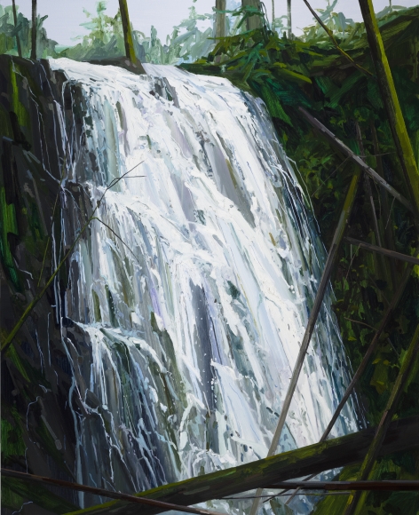
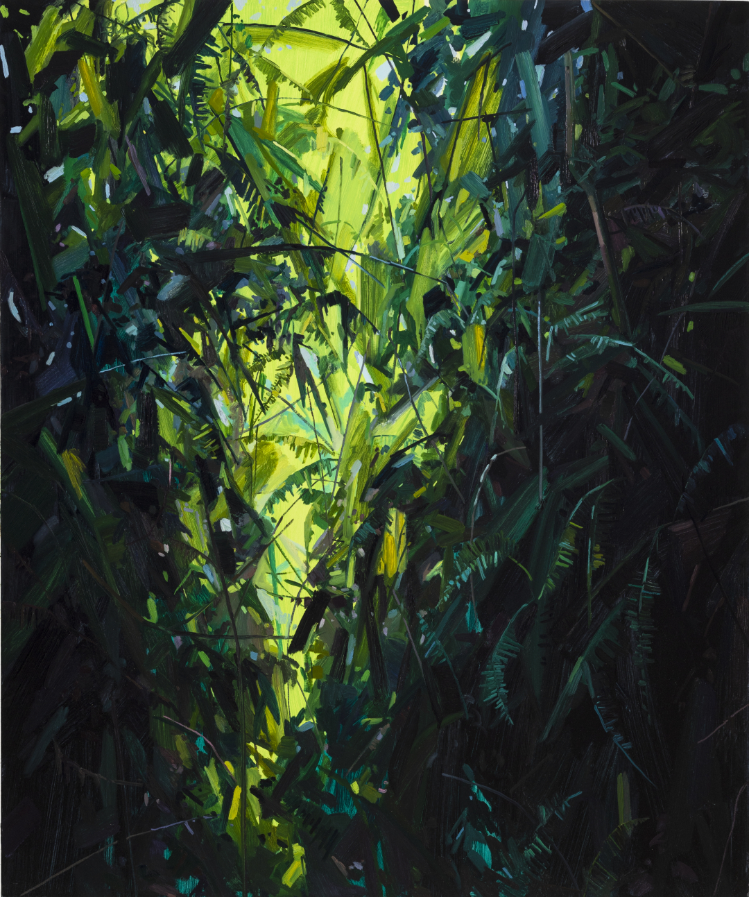
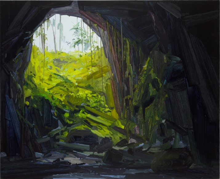
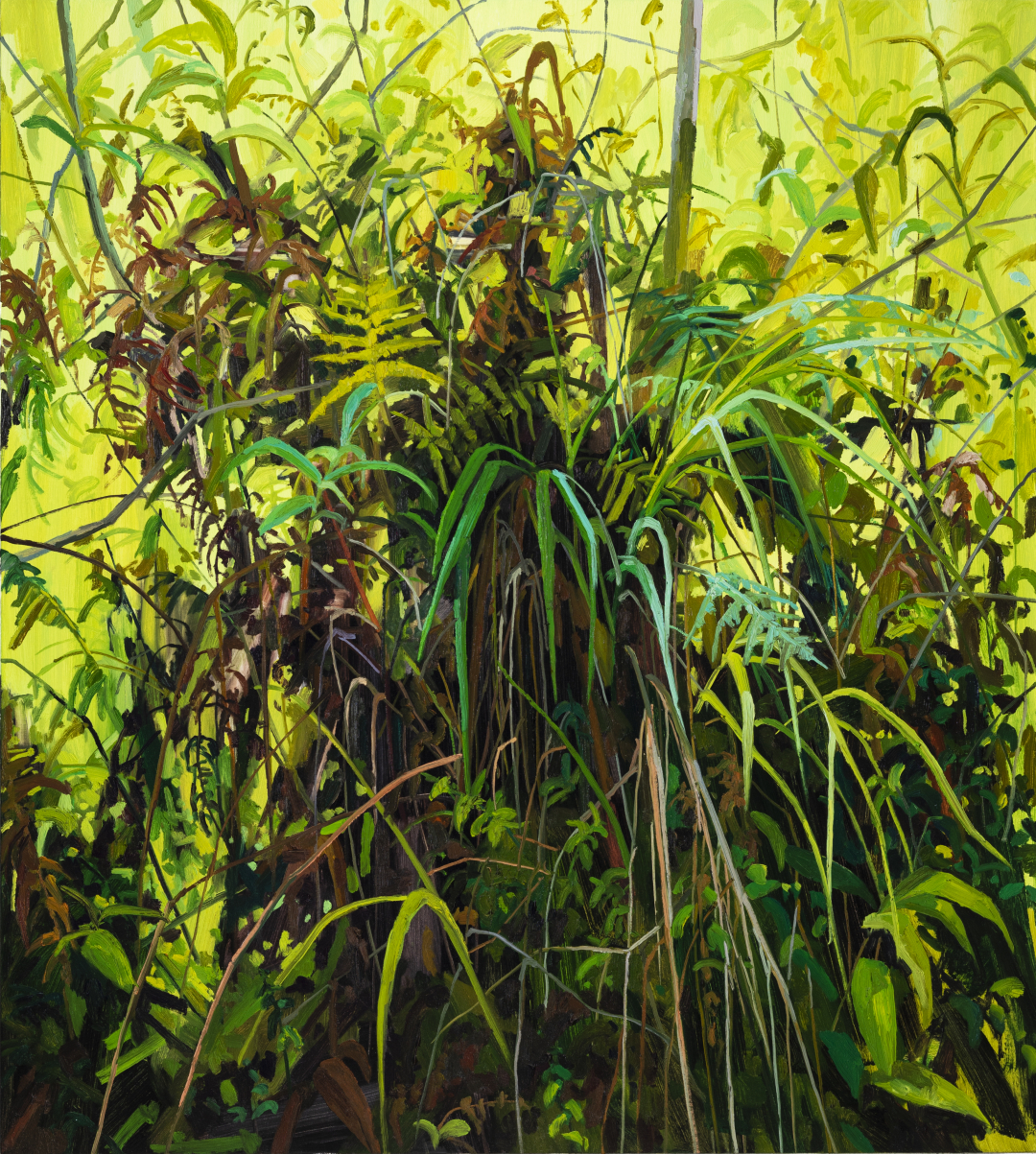
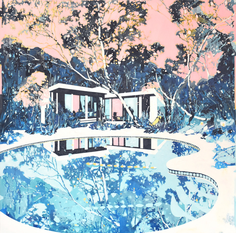
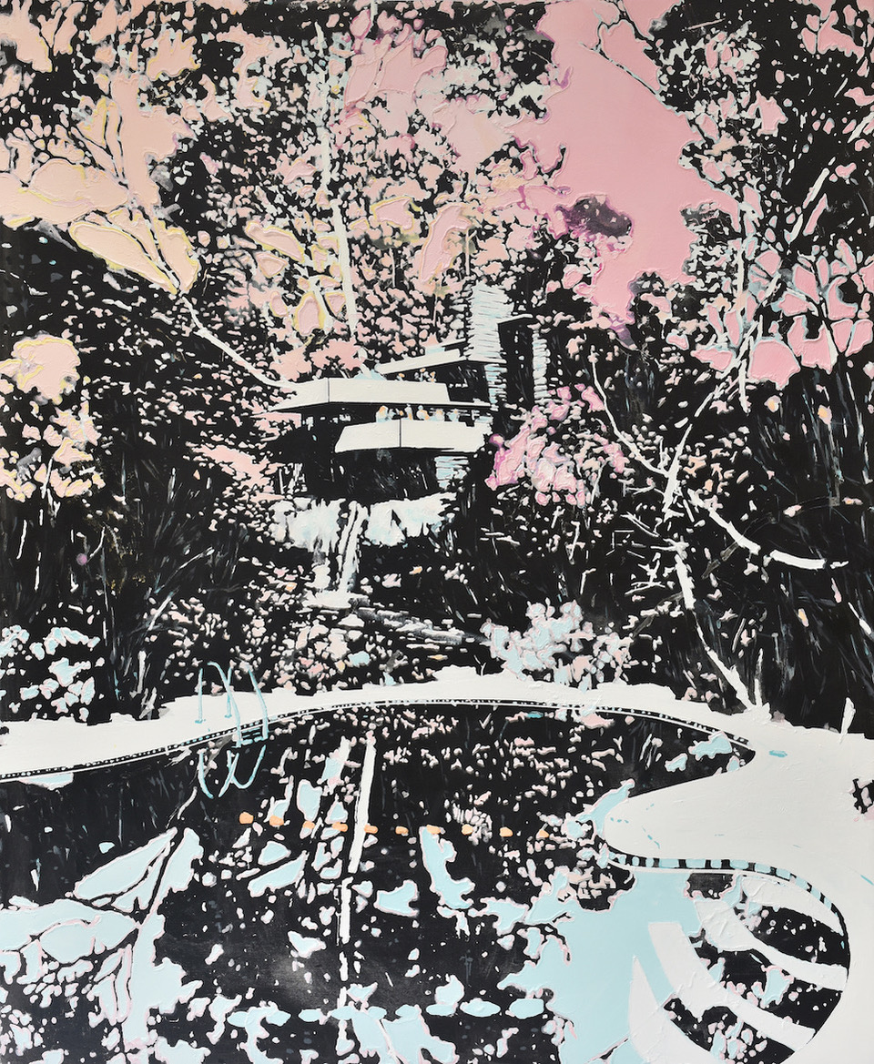
Paul Davies’ exhibition “The Roaring Daze” presented at Olsen Gruin showed a variety of fictional landscape paintings that Bury describes as “composites of the artist’s Australian heritage and adopted Los Angeles environs.” Both these environments are shown to influence the setting of his works. Despite how busy the paintings appear, there is still a sense of balance in the placement of objects. These paintings are have overall high key color schemes, contrasted by the dark colors of the foliage and shaded spaces of the trees and buildings. There are various other methods and techniques that Davies uses to create contrast in his works. For example, the paintings above seem to have a realistic quality to them like that of a photo, but techniques are used to deliberately create a somewhat abstracted feeling. The light, pastel pinks and blues enhance the idealistic beauty of the landscape, almost as if Davies is painting his vision of a paradise. However, Bury explains that the colors, techniques and objects that Davies uses have created tension between opposing concepts like nature and civilization, utopia and dystopia, and reality and fantasy. This tension creates an underlying feeling that this is not the paradise that it seems to be.

I recall reviewing another one of Bury’s articles previously, and have found that he shows great interest in the contrast that artists make in their works, through different themes in paintings, and even concepts coming from the artists’ means of creating their works. These contrasts he points out allow him to emphasize the effects created in the paintings, and help him to comprehensively explain his interpretations of the paintings. Of the two articles I reviewed by him, both were fairly representational; techniques were used to create a somewhat abstracted effect, but the objects in the paintings could be objectively seen. These paintings show appeal to both people outside of the “high” art world and within it as well. The objects in the paintings can easily be understood as they are, but deeper meaning can be found in them through analysis.

Article Analysis: “Claire Sherman’s Leafy Canvases”

This is a review of an article written by Louis Bury from Hyperallergic about Claire Sherman’s paintings of plant life and nature.

Between March and early April, Sherman’s work was displayed at the DC Moore Gallery in her exhibition “New Pangaea.” Various paintings of ferns, vines, waterfalls and the various flora living in nature are depicted in her works. These landscapes are all skillfully painted in oil, and many of them are created on canvases about 70 x 60 inches or even larger. Bury notes that the painting on the right, “Leaves and Vines” (2017), exposes the “sun-covered foliage” beyond the darker green thicket like a “curtain left a crack open,” while the painting on the left, “Waterfall,” (2019) puts much of the focus on the water and the cliff side, allowing the white water to cascade and fill the canvas. Individual leaves can be distinguished in the foliage through both her brushwork and her use of analogous colors; the wide variety of greens differentiates the leaves from each other but also is able to create a sense of unity in all of her paintings despite how they point in all sorts of directions.

Bury also observes that Sherman’s artwork appears figurative overall, but upon closer inspection her brushwork is shown to have the expressiveness and sense of abstract mark-making. I was uncertain about the definition of mark-making, and found that it describes the various lines and textures that can be used to create gesture in art. As seen in her paintings, this use of abstract and figurative qualities creates the intense, rushing sense of motion that can be felt in her waterfalls and also give her plants a “dynamic” and lively feeling, as if showing the life in them even if they are not as visually animated as a waterfall, like in the rightmost painting above, “Grass and Ferns” (2019). Even inorganic objects like caves feel “alive” as seen in her painting “Cave” (2018), which I feel exemplifies her ability to create life in her art.

Article Analysis: “Deceptively Playful Portraits Mask Personal Traumas”

“A Song, A Dream” (2018) Oil on Canvas (30 inches x 24 inches) 

“Ear Plugs”, (2019) Oil on Wood (11 inches x 9 inches)

This is a review of an article written by Sara Farell Okamura from Hyperallergic about the artist, Susan Carr.

Susan Carr had 75 paintings and sculptures featured in her solo exhibition FLIPSIDE, displayed at LABSpace in Hillside, New York this past May. Okamura remarks that the paintings seem “whimsical” and “carnivalesque” at first glance; the use of bright, bold colors and the childish style Carr paints her portaits in create this effect. However, the paintings begin to look more and more unsettling as they are more closely observed, revealing the artist’s underlying traumas. Her painting “Ear Plugs” seems like a child’s portrait with the bright colors and extremely thick texture – it is almost as if she had squeezed the paint from her tube directly onto the wood. The stark contrast between the equally intense colors is both eye-catching and unnerving, and the use of the 3D texture of the paint heightens the unnerving feeling, transforming the childish portrait into a maniacal and almost graphic depiction of a child that pops out to me. In many of her works, she uses these techniques to convey her intense feelings and traumas.

I noticed that in several of these works, the background is almost as loud as the main focus of the work, despite only being a single, constant color. The red in multiple paintings makes the subject of her works stand out in contrast and also creates a feeling of unsteadiness. In one of her paintings seen in the display above, she paints two figures hugging each other, heads tilted down under a deep blue sky with a black moon hanging over them. It invokes a feeling of sorrow and grief that the artist may be feeling. The article reveals that after Carr became a single mother at the age of 16, she dealt with decades of financial struggle and lost one of her sons, after which she began drawing a white figure with an eye for a head like in her painting. She later created a second figure, which is seen in paintings like the previously mentioned one and in her painting “A Song, A Dream,” as if trying to give her late son a friend so that he would not be lonely. Carr also explains in an interview that gesture, a term I am unfamiliar with, is a very essential part of both her work and humanity as a whole. After some research I found that it was a term used to describe the emotion felt in brushstrokes, something that can evidently be seen in her works.